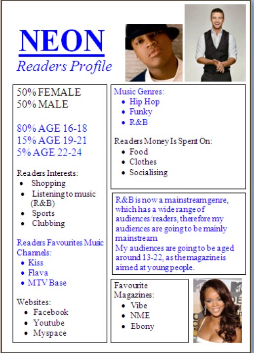
I researched magazines of the same and different genres to become familiar with their presentational deceives so I could compare my magazine with them. I have concluded that my music magazine Neon confirms the conventions of real music magazines. I would say my magazine is extremely similar to VIBE, this is due to the following reasons:
COMPARISONSimilarites:1) Both magazines use a male model, which could suggest that most audiences are males, who see them as role models and look up to them.
2) Both magazines use a similar masthead, quite simple yet large and bold to attract readers attention immediately.
3) Both magazines use a male black model, which is typical for a R&B music magazine.
4) Also props used in both magazines are very similar, both models are wearings chains and belts which are quite blingy.
5) Both magazines use 3 main colours.
However, it also has some differences such as:
Differences:1) The colour scheme of the two magazines is completely different. Neon uses the colours black, white and blue, whereas VIBE uses pink, black and yellow.
2) The pose/posture of the model on magazine Neon is different to the pose of the model on magazine VIBE.
3) Also the layout of the two magazines is very different.
My photograph confirms the conventions of real R&B music magazines as some of the conventions associated with that genre such as chains, blingy jewlerry and era hats, are used by my model. Similar to VIBE my models image takes up most of the space on the front cover and this is a convention of most magazines in general. Moreover, I have used a simple and similar background to VIBE. The inclusion of a cover line is also conventional of most magazines, therefore making the cover lines big is extremely important, so when a person sees the magazine the first thing they see/read is cover line. The cover line also demonstrates the artists thats going to be in the magazine, automatically attracting the reader. That is what I have tried to do with my music magazine. I have also tried to imitate the traditional sterotype involved with R&B magazine, that is the pose/posture of my model, similar to VIBE my magazine has a male model striking a rough yet tuff pose. The chains and blingy belt worn by my model is also conventional to the R&B genre. Moreover, the masthead is very simple but yet stands out, colour is very important to attracting the audience to get the sales, and I want my magazine to stand out from the rest.
Also the conventional technique of using a minimal of 3 colours is used widely in magazines. Therefore I have decided to use that on my own music magazine as it keeps it sophisticated and less complicated. Having a lot of different colours makes the magazine seem childish.